
Iconic Brand Logos and their New Benevolent Avatars - Johnnie Walker/ Jane Walker and Lacoste in Review + Brands that have changed their Logos honouring women on International Women's Day celebrations!
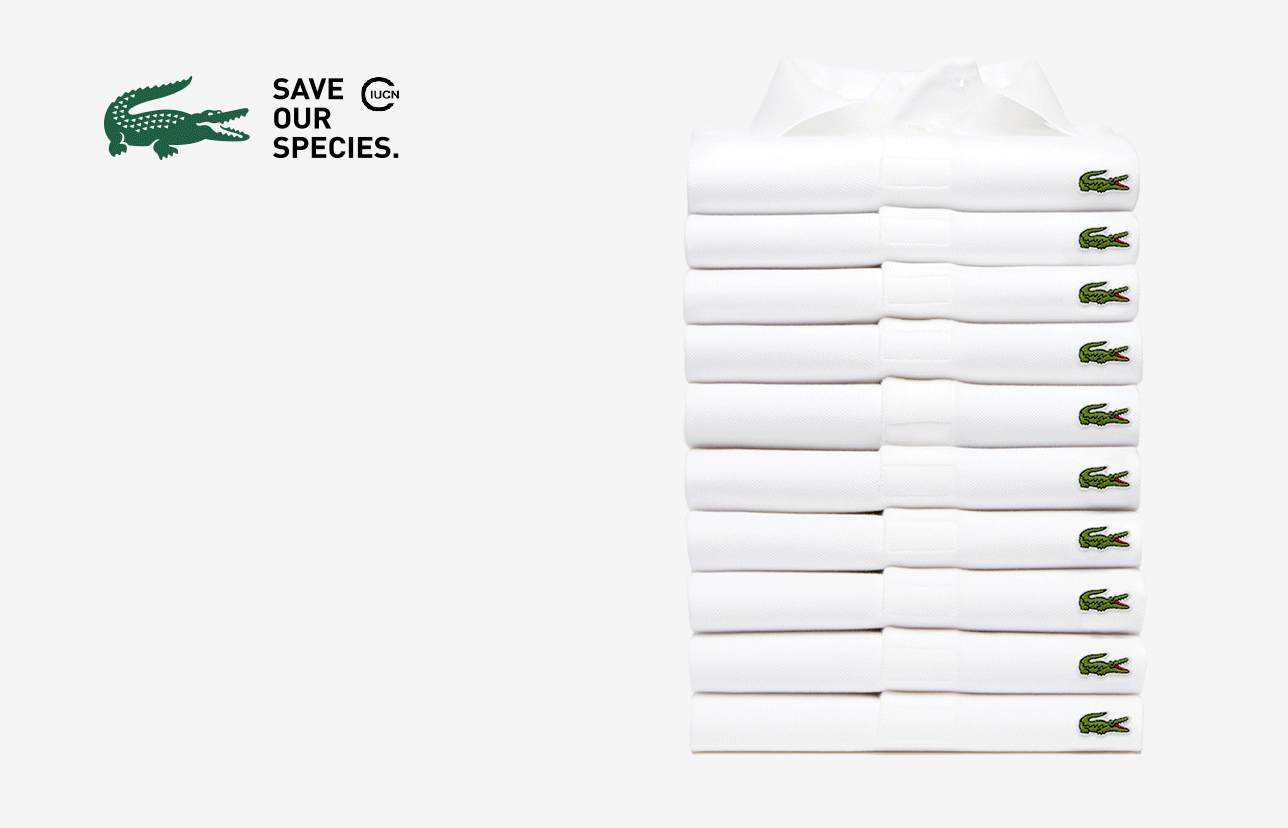 |
The crocodile leaves its iconic spot by
|
I don't write
about luxury consumers as much even
though they are as diverse segment as any
other cohort. The once wannabe act of logo-dropping is now re-emerging as a
real fashion trend ... Fashion weeks in
London, NYC, Milan and Paris have all had some iconic brands supporting sea of flashy insignias and that's why logos of big-name brands have once again become popular among luxury consumers in 2018.
While some luxury brands are
relying on a luxury consumer's affinity to their logos, some are branching
out into new product categories, rebranding themselves and their aesthetics
along with their logos altogether.
Guess which brands will be more successful? It’s what I call the Symbolism
Vs Substance paradox as appearance of authenticity cannot be created in the absence of honesty.
Today’s cultural shifts are based on the premise of doing and
action, not on talking alone and in the case of Johnnie Walker and Lacoste, it is about a simple and clever extension of the brand and one, that makes a stand too!
For consumers it’s about what brands do, and not
what brands say. By changing their iconic logos these brands are spotlighting on
the importance of making a real difference that resonates very well with consumers’
sentiments who give more importance to substance than symbolism. It is an astute way to begin a conversation about social responsibility.
Iconic
logos have increased brand recognition in the past but with continued and
widespread adoption of inclusive practices and wading
in on current social or political issues
globally shows
that the benevolent channel is becoming an integral part of the advertising and
marketing strategy. In fact, one of the major revelations in this regard
by Adweek points towards the gradual maturing of brands
by supporting diversity and issues that challenge it suggesting that operating
in profit and silos is no longer an option!
At Diverse
Customer, we want to congratulate Lacoste and Johnnie Walker for the change
they are ushering in. Both have struck a nice balance here with their label and marketing.
For instance, the green color in case of Lacoste and packaging in case of Johnnie Walker remain constant, not to confuse their regular customers, yet the change happened enough to accentute the role of women in the industry and hence Jane Walker, and enough to accenuate the need of the hour to save our species in case of Lacoste.
For instance, the green color in case of Lacoste and packaging in case of Johnnie Walker remain constant, not to confuse their regular customers, yet the change happened enough to accentute the role of women in the industry and hence Jane Walker, and enough to accenuate the need of the hour to save our species in case of Lacoste.
Instead of the traditional crocodile logo, Lacoste is featuring ten animals on the brink of becoming extinct. Proceeds from the sales of the
shirts will go towards preserving the endangered species.
 |
| Image: lifestylefood |
In another
example of excellent marketing campaign and related brand positioning and of
course, great charitable initiative
as the part of the proceeds from the sale going to the charity monumentalwomen honouring America 's female suffragists. To me personally, this move is about strengthening, and not emasculating a logo and by way of doing so, telling that women are much bigger than just a gender or a label. It is definitely not tokenism or a mockery of gender equality as it is being looked at by many people or even choosing a generic "Jane" over "Elizabeth", the wife of founder John Walker who fundamentally contributed to the creation of their own blended whiskey. Nothing would
stop Diageo to create a scotch brand only for women but making Jonnie Walker
the mother brand for Jane Walker is brilliance personified.


The campaigns made us: Notice. Think. Talk. I believe that's akin to Job Well Done :)
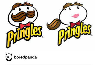
9 Iconic Brand Logos Get Transformed Into Female Versions, And The Results Look Awesome


Images from Bored Panda 🐼
The campaigns made us: Notice. Think. Talk. I believe that's akin to Job Well Done :)
- Amit Anand
Comments
Post a Comment
Thanks for commenting!